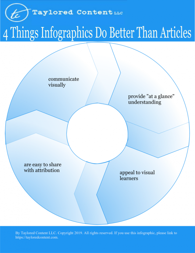
4 Things Infographics Do Better Than Articles

What Does An Editor Do?

5 Ways an Editor Can Improve a Project

It might seem strange that a writer of words would throw in the towel and admit that the visual arts has them beat. But let’s not jump to conclusions. I’m not giving in. I’m simply admitting the limitations of my craft. I’m still devoted to the written word, but I recognize that it isn’t–and can’t be–all things to all people.
Graphics also their value. Infographics, specifically, are capable of getting a point across in a much more powerful way than articles can. Here are four specific ways that infographics are better than articles at communicating.
- Infographics communicate visually – The old adage “a picture is worth a thousand words” is not merely a salvo. Putting words into images is itself a form of art, and the graphic artist who can turn 1,000 words of beautiful prose into a visual thesis is worth her weight in gold. In the amount of time it takes a reader to analyze that millennial flower of verbiage, an infographic can make its point and drink a cup of coffee.
- Infographics provide “at a glance” understanding – Elaborating on that last point, a well-presented infographic gives your audience a more direct route to mentally capture your point. While some infographics can be long and complex, if you take those graphic articles and convert them entirely into text, you’ll find that in article form they are lengthier, more involved, and quite time consuming. While there are times when you’ll want to take up the real estate necessary to express yourself in words, there are other times when you’ll want to get to point more quickly. In those times, an infographic is most helpful.
- Infographics appeal to visual learners – In general, educators have broken learning styles into four categories. Some educators break it down into eight learning styles. However you break down the learning style ecosystem, you’ll inevitably discover that one of those styles is visual. A certain percentage of your audience is going to consist of visual learners. One Forbes writer believes it’s 65 percent. Another writer disagrees. Whether or not one buys into the preferred learning style model of teaching, the truth is, infographics may appeal to certain types of audiences more than others (just as your articles may appeal to another type of audience). In that case, your brand would suffer if you didn’t provide visuals for those members of your audience who prefer it.
- Infographics are easy to share with attribution – If you have a message you want to spread far and wide, an infographic is a better form than an article. With an article, another publisher will likely have to copy and paste your content and link back to it. Not only will this take up more of their time, but it provides built-in opportunities for error. Plus, they’ll likely have to ask you for attribution unless your website explicitly grants the right to republish your material. By contrast, an infographic footer can encourage redistribution and all you have to do to receive attribution is include your company logo and website URL in the graphic itself. If someone ethically appropriates your content, you’re more likely to get the attribution you deserve with an infographic than you are an article, and you won’t have to spend any time chasing down owners to issue a Digital Millennial Copyright Act takedown notice.
As much as I like articles, I’m realistic enough to admit that sometimes an infographic is better suited to getting my message across. And just so you know I’m not full of it, I’ve decided to put my money where my mouth is. Enjoy the infographic that illustrates the point of this article.